Monday, 6 October 2014

Jason Dean

Jason Dean Artist Page:

 Images of art work:

These posters came through a complex process beginning with the creation of hand-rubbed relief prints from basic lumberyard 4 x 4’s. The individual relief prints were then scanned and used to create film for screen printing. The wood was then burned, meticulously ground and added to the ink mixture to literally impart wood into all aspects of every print. The result is a poster that reflects the many ways we process trees, including cutting it into commercial lumber,
pressing it into paper and burning it into
charcoal.

 My view:
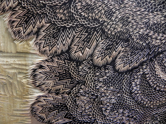


I like how his work is a lot
different to most and despite being modern, it also has rustic feel and look to it. However his work does not stand out and seems to have the same pattern and effect for each piece, meaning it will not catch the eye of a
viewer and will not appeal as much as 
other art works.


Tuesday, 16 September 2014

Save The Rainforest Evaluation

Evaluation of Topic:

I started off by researching into different charities and after a long while of making my decision, I decided to go with a charity based on Saving the Rainforest. I decided to go with this one due to the wide array of things I could work with and how many different aspects of the topic there is to work on. I had various ideas with what I was going to do with each of my designs.

In the end I decided to go with a phone case for my freebie item as it would have a chance of striking interest of "Saving the rainforest" into the minds of younger people due to the increase in use of technology. The freebie was very easy to design only taking a few steps to design but still has a professional finish and look to it making it simple but effective.

Next I began on my poster which with only two images and some text created a powerful poster partnered with a rhetorical question to make the viewer really think about the image. It shows the importance of the rainforest not only for its looks but the many jobs it does and purposes it serves.


Finally I began my logo which really suits the topic I have chosen. I used the blank letters and a circle shape to create the basics of the logo and implemented a rainforest background to enhance the foreground and give it a better impact to the viewer and intrigue them further into the subject I have chosen. 


Tuesday, 1 July 2014

Animal Rights


The RSPCA is a company which helps animals that may be being abused by owners, or they bring them in off of the street. They care for animals in need from small reptiles and cats, to large dogs and horses. RSPCA meaning Royal Society for the Prevention of Cruelty to Animals.


Monday, 9 June 2014

Analysis of Awareness Campaigns

Awareness Campaigns

Children's Charities: The images were very powerful and showed a very basic range of colors that were straight to the point and really enhanced the image in the foreground.


Surfers Against Sewage: The campaigns varied and some showed strong bright beach-like colors and others used dark colors and graves showing a very powerful image.


Save the Rainforest: All of the campaigns had a very deep and meaningful impact, it used some of the things you may see in the rainforest and showed what happens to them when the environment they live in is taken away.


Animal Rights: All of the campaigns had a powerful meaning and moral behind them and made you think about the campaign itself. The campaigns were very creative and used a contrast of dark and light colours.

Children's Charities


Surfers Against Sewage


Animal Rights


Save the Rainforest


Monday, 2 June 2014

Nelson Makamo Homework

Nelson was born in Nylstroom (now modimolle) in Limpopo he participated in a number 
of local exhibitions in Limpopo before finding his way to artist proof in studio 2003 he 
received his APS certificate in advanced professional printmaking in 2005 since then, 
Nelson has worked as a professional artist and as a marketing sales administrator for 
the APS gallery. Nelson was selected as art South Africa's seventh bright young thing in 
2007 in the same year he had the first International exhibition in simmer Lombardo, 
(Italy) followed in 2008 with the International solo exhibition in Amsterdam in January 
2009 Nelson resigned from the gallery position to devote himself full time to his art.


Mono prints can differ in appearance, some are hazy and dark colours and others are vibrant and 
have a large variety of colours.


I like his work because it shows all different meanings behind it and can have a different impact of 
each viewer, and his work is different to most mono prints I have seen when searching.

Wednesday, 21 May 2014

Printing - Step by Step

Step 1: Get some large card and some ink and put a blob of ink in the middle of the card.

Step 2: Using a roller spread the ink into roughly an A4 sized shape.

Step 3: Place a sheet of newspaper over the A4 size/shaped splat of ink and rub your hands across the paper making sure the ink is settled.

Step 4: Remove the newspaper sheet and place it in the bin or just get rid of it.

Step 5: Grab a piece of A4 card/paper and begin drawing your images/text ensuring you do not lean on he image, however you have to write he text backwards for it to have the correct appearance when you are finished.

Step 6: Peel off the paper the paper you have drawn/written on and you will have your finished product! 


When you're finished you will have something like this!


Printing Images


Tuesday, 29 April 2014

World Leader


Self Asessment

What have I learned this lesson?
I have learned how to make a collage of a cluster of small images to make one complete logo. 

What does 'Mixed Media' mean?
using different artistic media: the use of different artistic media, e.g. painting, photography, and collage, in a single composition or work.

What technique have we learned?
I have learned the technique of using lots of small images from the media e.g. papers and magazines to make one large image of something that is in the media or a polar topic. 

How have we created tone in our collaged sections?
We created tone in our collage by using different images to create one, meaning there is a mixture of colors creating tone.

What magazine page have we used to create the different patterns and textures?
I used newspapers such as 'The Times' 'The Daily Mirror' 'The Guardian' and magazines such as the Penrice Magazine

Hannah Hoch


Monday, 21 April 2014

Homework


 Looking down a building.


Looking through an object

 Colourful structure

looking up a building


Archway

Monday, 24 March 2014

Stencils-So far

 This stencil was made on plain white paper with purple and orange blended together, I sponged the two colors and blended it in the middle so that the blend from the orange to purple. This was the easiest and most effective paper. The stencil I have done is representing Domestic violence, the image shows the word stop with the 'o' as a fist.
 In this stencil design

Monday, 3 March 2014

Wednesday, 26 February 2014

Cause For Concern

Cause For Concern.

Domestic Violence

I choose Domestic Violence as my cause for concern as it has been a popular topic in the past and has recently just been in the news and awareness is now being spread through schools in the U.K. It has been a popular topic throughout the U.K. especially and also internationally it is a popular agenda.


Domestic violence, also known as domestic abuse, spousal abuse, battering, family violence, dating abuse and intimate partner violence is a pattern of behavior which involves the abuse by one partner against another in an intimate relationship such as marriage cohabitation, dating or within the family.


Smoking Campaign Mockup