Monday, 6 October 2014

Jason Dean

Jason Dean Artist Page:

 Images of art work:

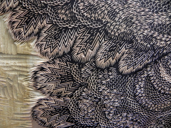
These posters came through a complex process beginning with the creation of hand-rubbed relief prints from basic lumberyard 4 x 4’s. The individual relief prints were then scanned and used to create film for screen printing. The wood was then burned, meticulously ground and added to the ink mixture to literally impart wood into all aspects of every print. The result is a poster that reflects the many ways we process trees, including cutting it into commercial lumber,
pressing it into paper and burning it into
charcoal.

 My view:


I like how his work is a lot
different to most and despite being modern, it also has rustic feel and look to it. However his work does not stand out and seems to have the same pattern and effect for each piece, meaning it will not catch the eye of a
viewer and will not appeal as much as 
other art works.


Tuesday, 16 September 2014

Save The Rainforest Evaluation

Evaluation of Topic:

I started off by researching into different charities and after a long while of making my decision, I decided to go with a charity based on Saving the Rainforest. I decided to go with this one due to the wide array of things I could work with and how many different aspects of the topic there is to work on. I had various ideas with what I was going to do with each of my designs.

In the end I decided to go with a phone case for my freebie item as it would have a chance of striking interest of "Saving the rainforest" into the minds of younger people due to the increase in use of technology. The freebie was very easy to design only taking a few steps to design but still has a professional finish and look to it making it simple but effective.

Next I began on my poster which with only two images and some text created a powerful poster partnered with a rhetorical question to make the viewer really think about the image. It shows the importance of the rainforest not only for its looks but the many jobs it does and purposes it serves.


Finally I began my logo which really suits the topic I have chosen. I used the blank letters and a circle shape to create the basics of the logo and implemented a rainforest background to enhance the foreground and give it a better impact to the viewer and intrigue them further into the subject I have chosen. 


Tuesday, 1 July 2014

Animal Rights


The RSPCA is a company which helps animals that may be being abused by owners, or they bring them in off of the street. They care for animals in need from small reptiles and cats, to large dogs and horses. RSPCA meaning Royal Society for the Prevention of Cruelty to Animals.


Monday, 9 June 2014

Analysis of Awareness Campaigns

Awareness Campaigns

Children's Charities: The images were very powerful and showed a very basic range of colors that were straight to the point and really enhanced the image in the foreground.


Surfers Against Sewage: The campaigns varied and some showed strong bright beach-like colors and others used dark colors and graves showing a very powerful image.


Save the Rainforest: All of the campaigns had a very deep and meaningful impact, it used some of the things you may see in the rainforest and showed what happens to them when the environment they live in is taken away.


Animal Rights: All of the campaigns had a powerful meaning and moral behind them and made you think about the campaign itself. The campaigns were very creative and used a contrast of dark and light colours.

Children's Charities


Surfers Against Sewage


Animal Rights